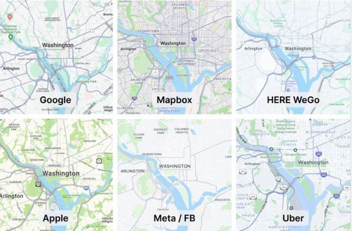
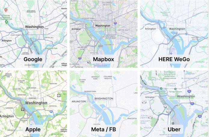
Google Maps’ new color palette has users comparing it to Apple AAPL 0.07%↑ and a number of other competitors. While users first noticed the change in colors back in September, according to published reports, it looks like the company has made the color scheme available permanently.
Most media reports have been negative, basically saying that Google Maps, while not perfect, had a solid, and very readable, color scheme (and some users on Reddit and Twitter have also complained about the new version). Now, it’s as bland as the next mapping company:

Elizabeth Laraki, who helped design Google Maps, also doesn’t like the new look. “I don’t love it. It feels colder, less accurate and less human. But more importantly, they missed a key opportunity to simplify and scale,” Laraki said, in an X post (formerly Twitter).
Laraki said that while Google’s goal was to improve usability and make the maps more readable, it did the opposite. “Admittedly, I do think major roads, traffic, and trails stand out more now. But the colors of water and parks/open spaces blend together,” she said. “And to me, the palette feels colder and more computer generated. But color choices aside, if the goal was better usability, the team missed a big opportunity.”


